
How to Choose Colors for Patterns
Choosing color palettes for your designs can often be daunting, where do you start? Do you have enough colors? Will they look nice together? There are so many questions and things to consider when selecting your color palette for your work. Here are some things to consider and some places to start . . .
Color Theory
It is helpful to have a basic understanding of color theory. As a former art teacher, color theory was always an aspect of my curriculum! So here are some basics if you aren’t familiar with the topic.
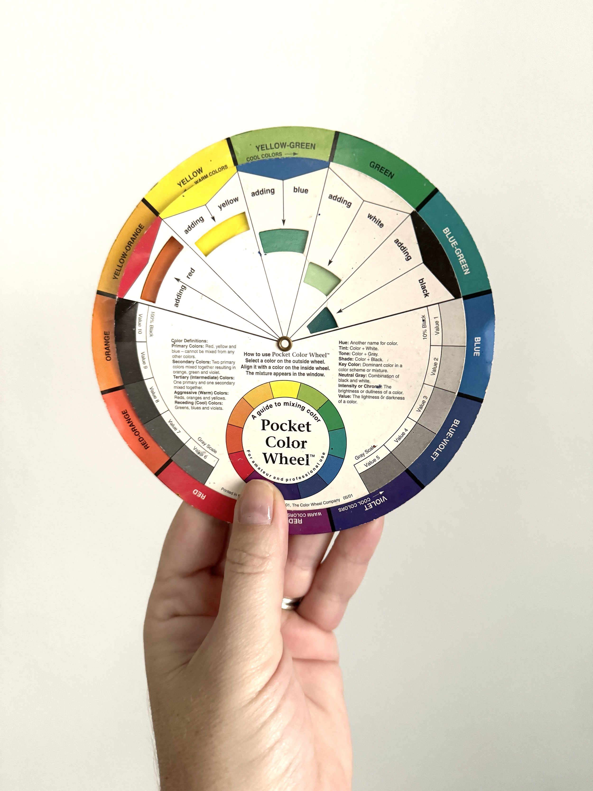
A color wheel is a diagram that shows the relationships of colors to each other and can be helpful when putting together color palettes.
COMPLIMENTARY COLORS
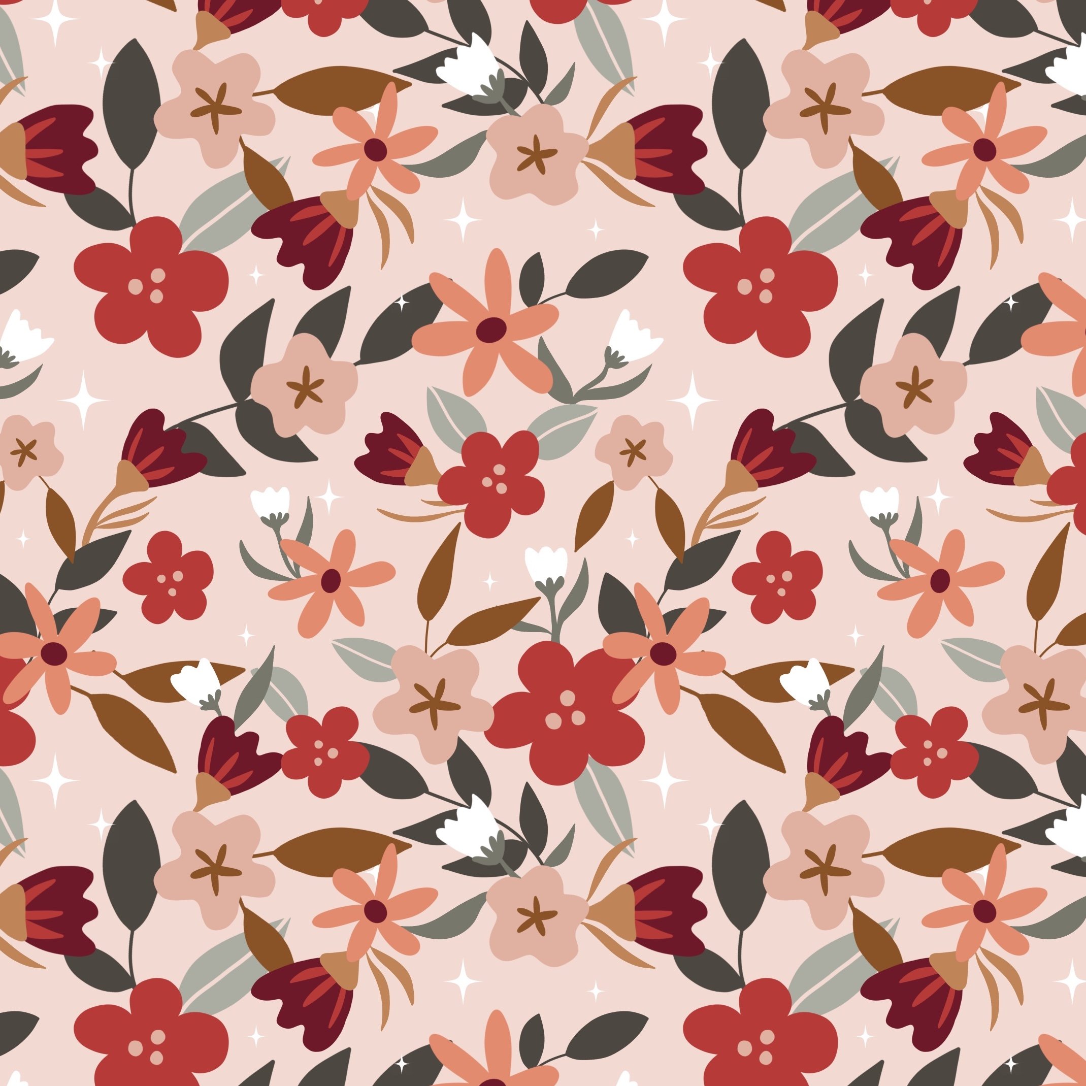
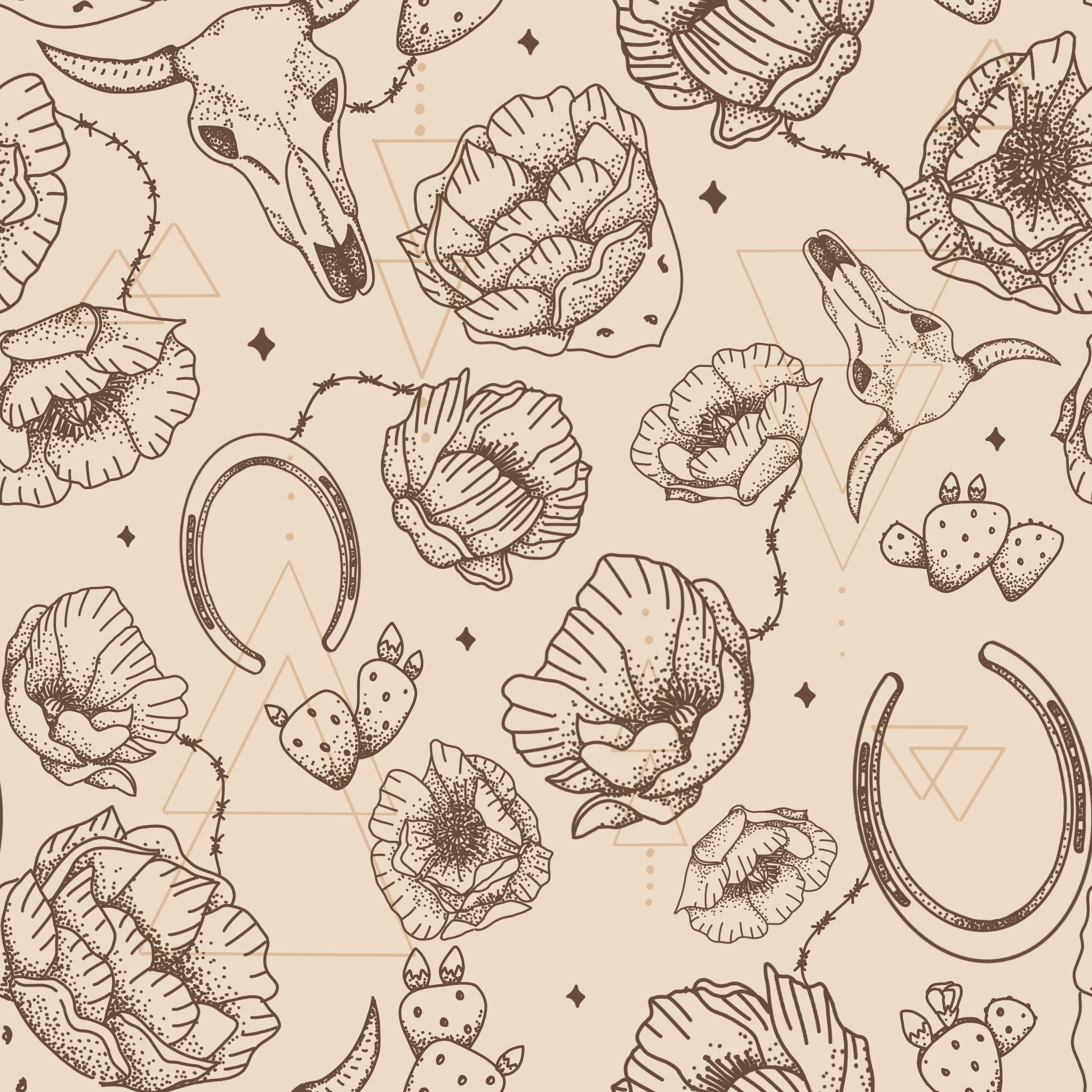
Colors across from each other on the color wheel are considered compliments. This means that there is an optical illusion where if you put them next to each other they make each other seem more vibrant and bright. Alternatively, if you mix them they do the opposite and dull the colors and if you mix enough, they will become neutral colors. Here is a pattern I created with a complimentary color palette (reds and greens)
Analogous Colors
Analogous colors are colors that are right next to each other on the color wheel. These are very harmonious colors and get along well. These are great colors to include in your color palettes and they relate to each other.
Triads
Triads, a triad are three evenly spaced colors on the color wheel and can be a great starting place for interesting color palettes.
Tints and Shades
By adding white to your colors you get what are called “tints”, these tend to be your pastel-looking colors. By adding black to your colors you get “shades”. A tip for people who are mixing colors traditionally, if you want to darken a color, add black and a darker color on the color wheel such as blue. Just adding black will dull your color a little so adding a little bit of blue or another darker color than your original will preserve some brightness.
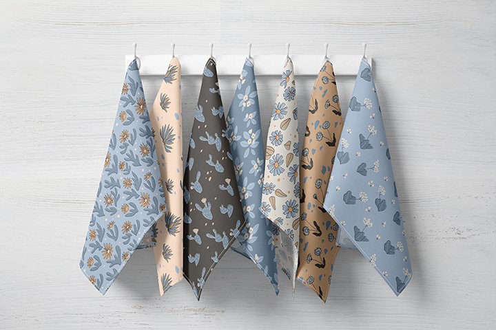
Monochromatic
Monochromatic color schemes are those that contain one main color with tints and shades of that color. Here are some of my monochromatic patterns
Color Psychology
Some other things to consider are the temperature and the psychology of colors. Half of the color wheel is considered cool colors and half are considered warm colors. This can be helpful if you want to create a particular mood or feeling with your composition. There is also some psychology associated with colors that could be useful. For example, red is an energetic color that can boost our appetite and make us want to take action. That is why this is often used in fast-food restaurant design and for sale signs. Green makes us think of healthy things and blue can be a calming color. If you search color psychology online you can find some really interesting stuff. Designers often use this knowledge so it is helpful to be aware of.
Finding Inspiration
Now that we covered the basics of color theory, where do we start with building our palettes? I find it hard to start from scratch so my most common starting place is Pinterest. I have a Pinterest board where I keep all of the color palettes that catch my eye. I often take a screenshot of a color palette on Pinterest and then put it into Procreate to pull colors from and then work from there.
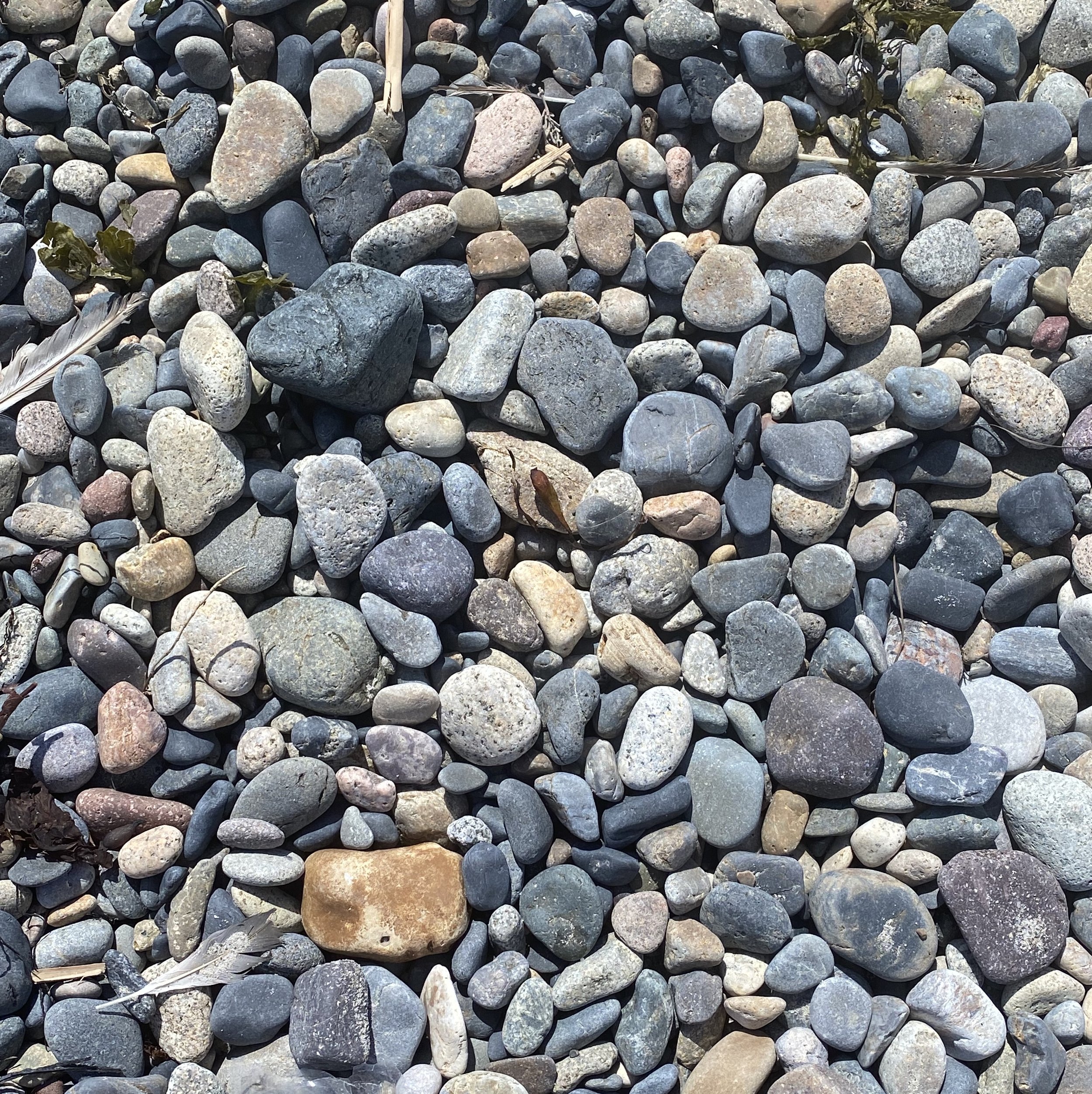
PHOTOS
I also will take photos of things that have a nice color palette as I am out and about. This could be other products that have a nice color scheme or this could be photos of things in nature. I once created a whole palette from ocean rocks I photographed at the beach. It is still one of my favorite palettes. I also pull those into Procreate to select colors from.
Trending Colors
The last place I tend to look is at trending colors. I keep a database of current trends and will sometimes pull a color from there to include.
Making Adjustments
Once I have a starting place I can then start to manipulate the colors or add colors to my palette. Some things I consider when doing this are contrast and range. I do like working with limited color palettes so that my work has a cohesive look but you need to have enough to create some interest. Having to many colors can make your work look like it is all over the place. I usually start with at least 6 colors and adjust from there. As for contrast, if all your colors are similar value, meaning if they were turned to greyscale they would all look the same, then it doesn’t create much interest in your designs. I like to make sure I have at least one darker value and one lighter value in my palette.
Resources
There are many online tools that are also great for checking out colors, here are a few:
This Color Cube created by Sarah Renae Clark
Self Critique
Here are some questions to ask as you develop your color palettes and put them into your compositions:
What is the hierarchy of my colors, what color is used most? What color is used sparingly?
Do these colors work together? Are there colors getting lost? Does it hurt your eyes when two colors are placed next to each other?
When designing for a particular theme, do the colors make sense for that theme?
Are these colors marketable? Appropriate for my target market?
Do I need more colors to add interest?
Are your colors creating the feeling you are looking for when put together?
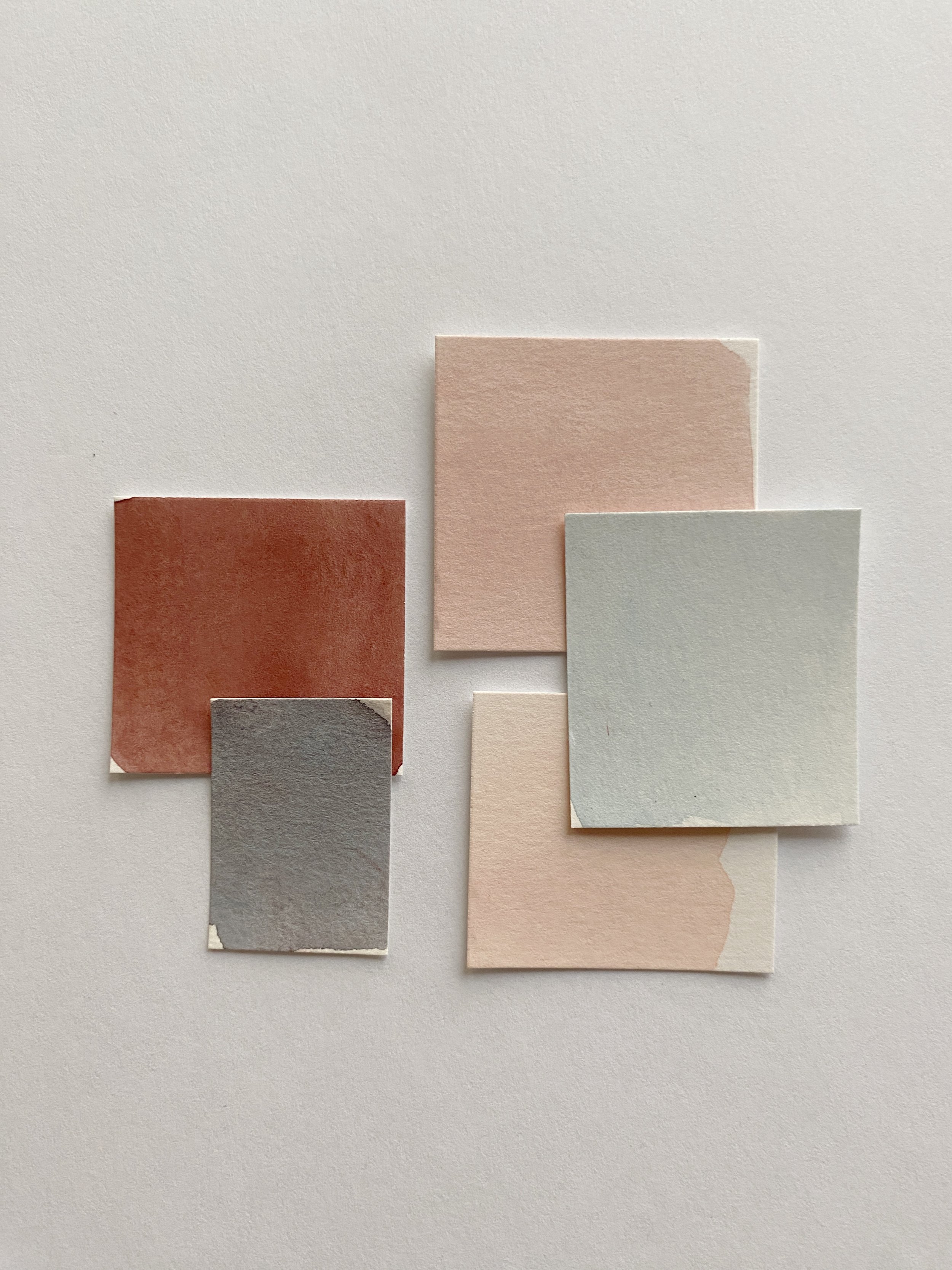
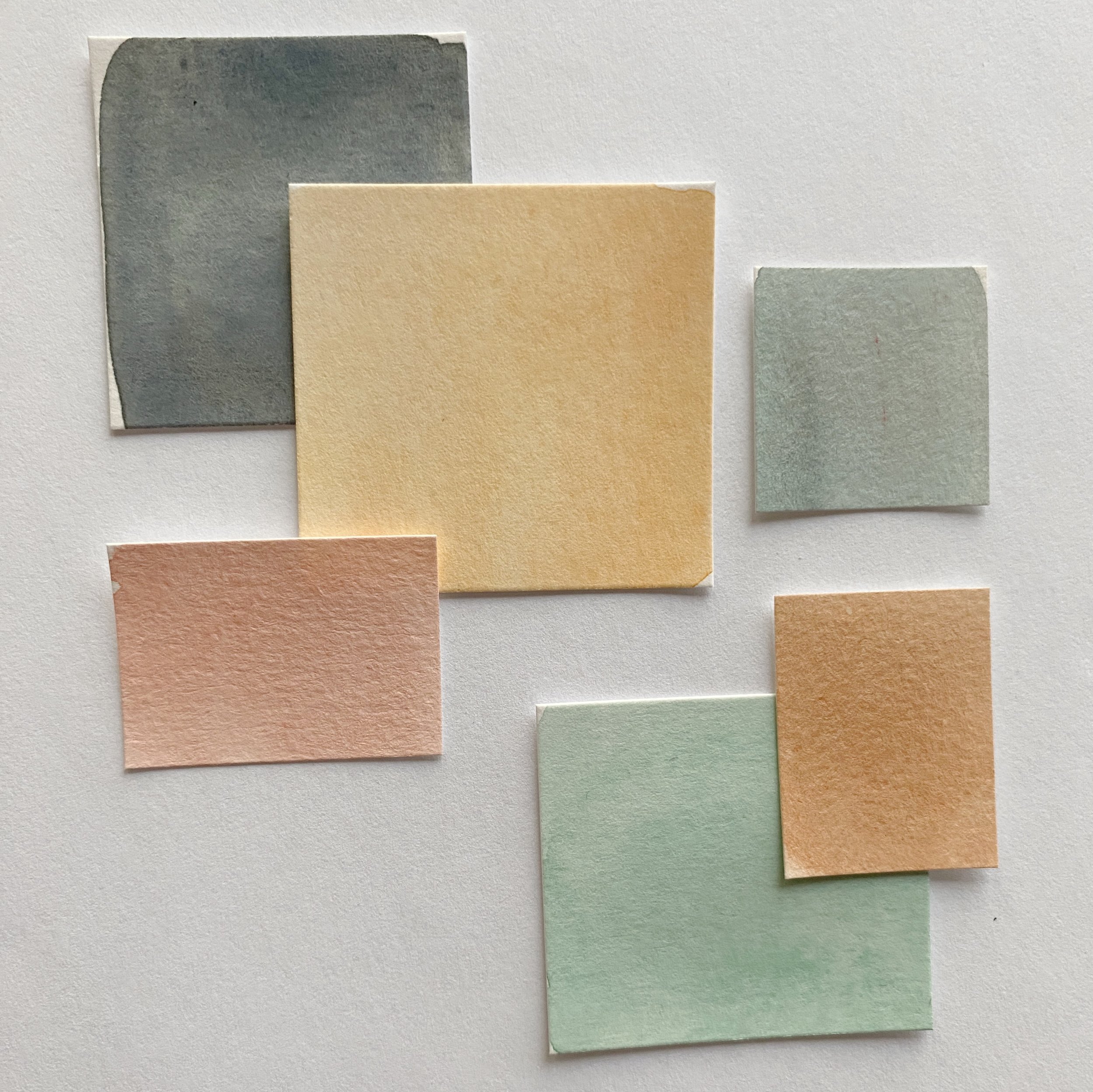
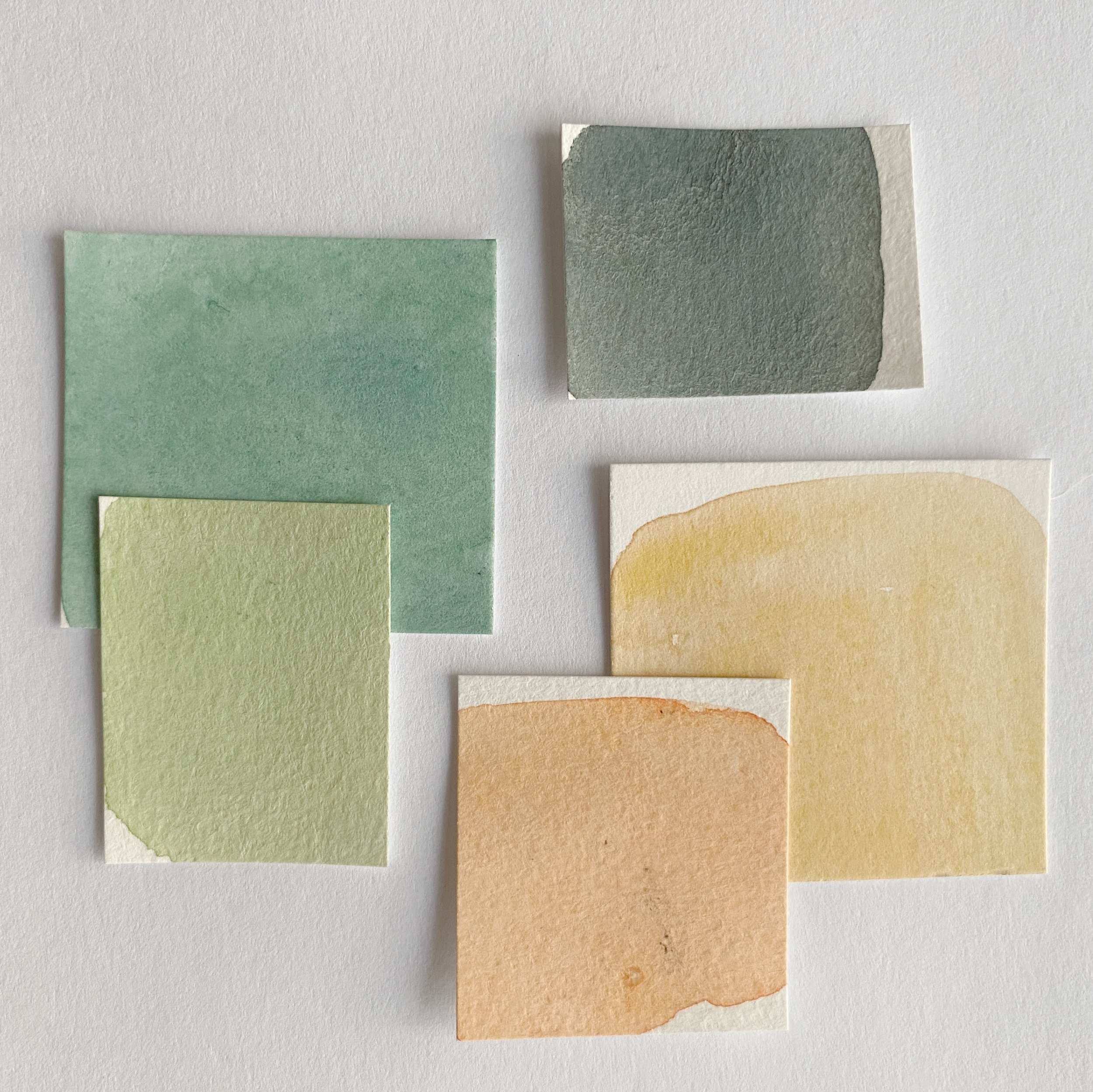
Here are some of the color combinations that I really enjoy and often use:
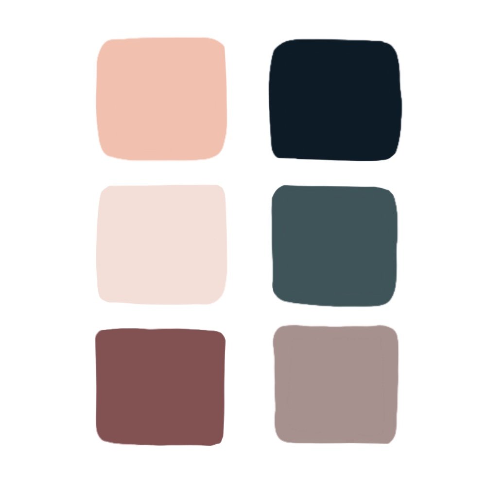
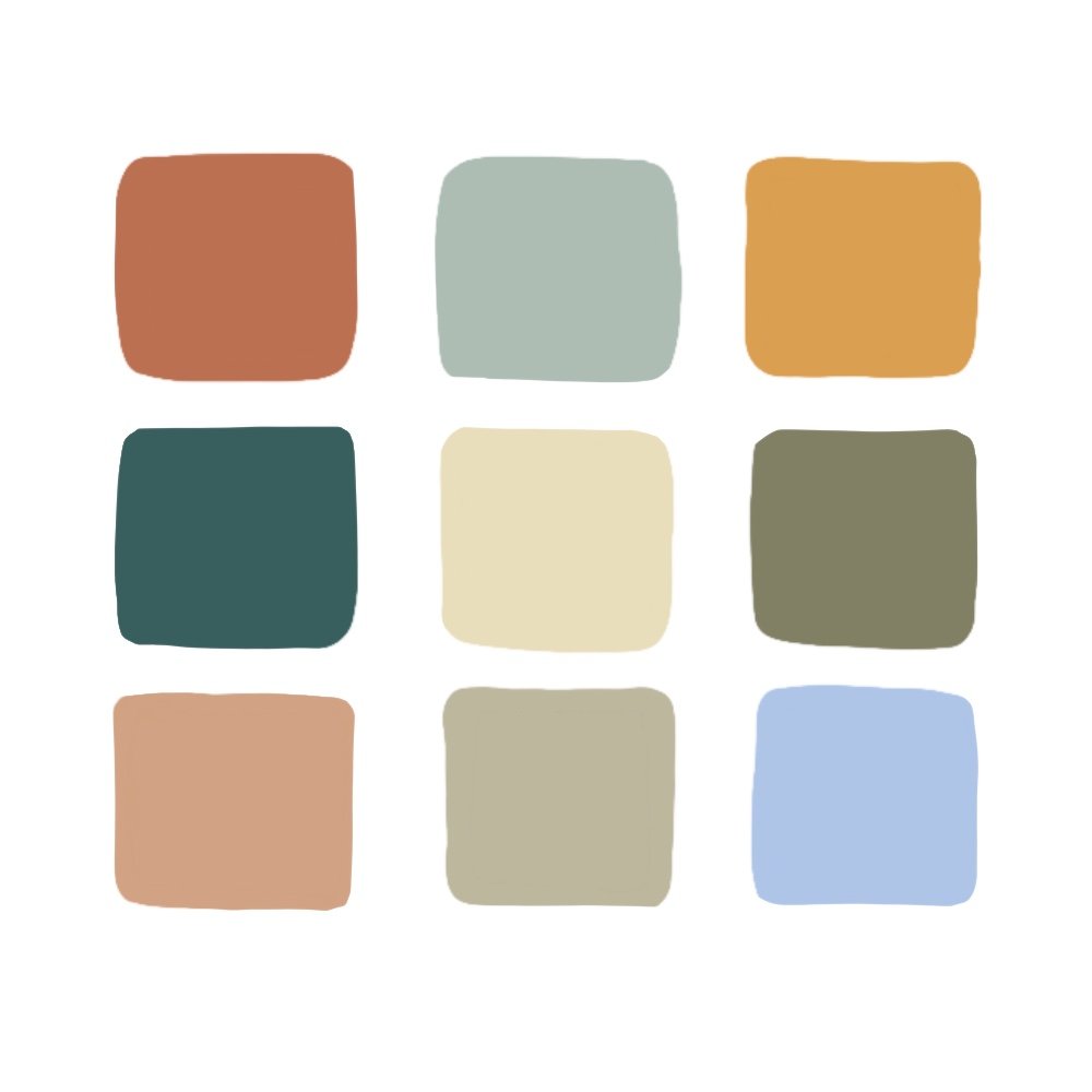
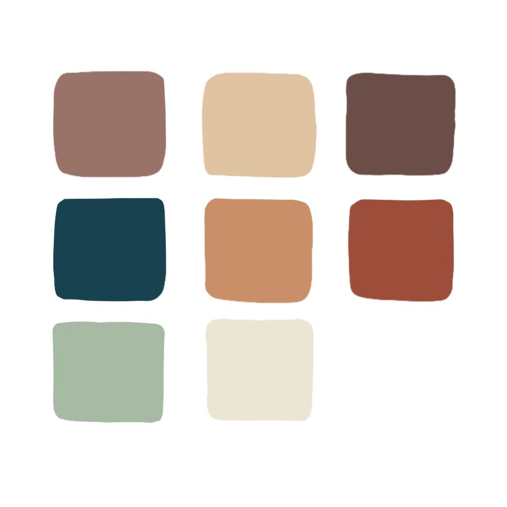
As you start to build up your color palette library you may find that you gravitate towards certain colors. This can help you develop your style. I tend to like more muted and earthy colors over bright and neon colors.
Troubleshooting
If you are feeling stuck with your designs and colors, here are a few things to try:
Sometimes just changing the background color of a palette changes the whole feel of the pattern. I often play with going from a light background to a dark background just to see what it does to the pattern.
I often use the recolor tool in Illustrator just to test out different palettes. Sometimes I can change from hating a pattern to liking one by just changing the colors.
Try a color that is a little out of your comfort zone just to mix it up a little.
Experiment and play! Keep note of your favorite colors to work with.
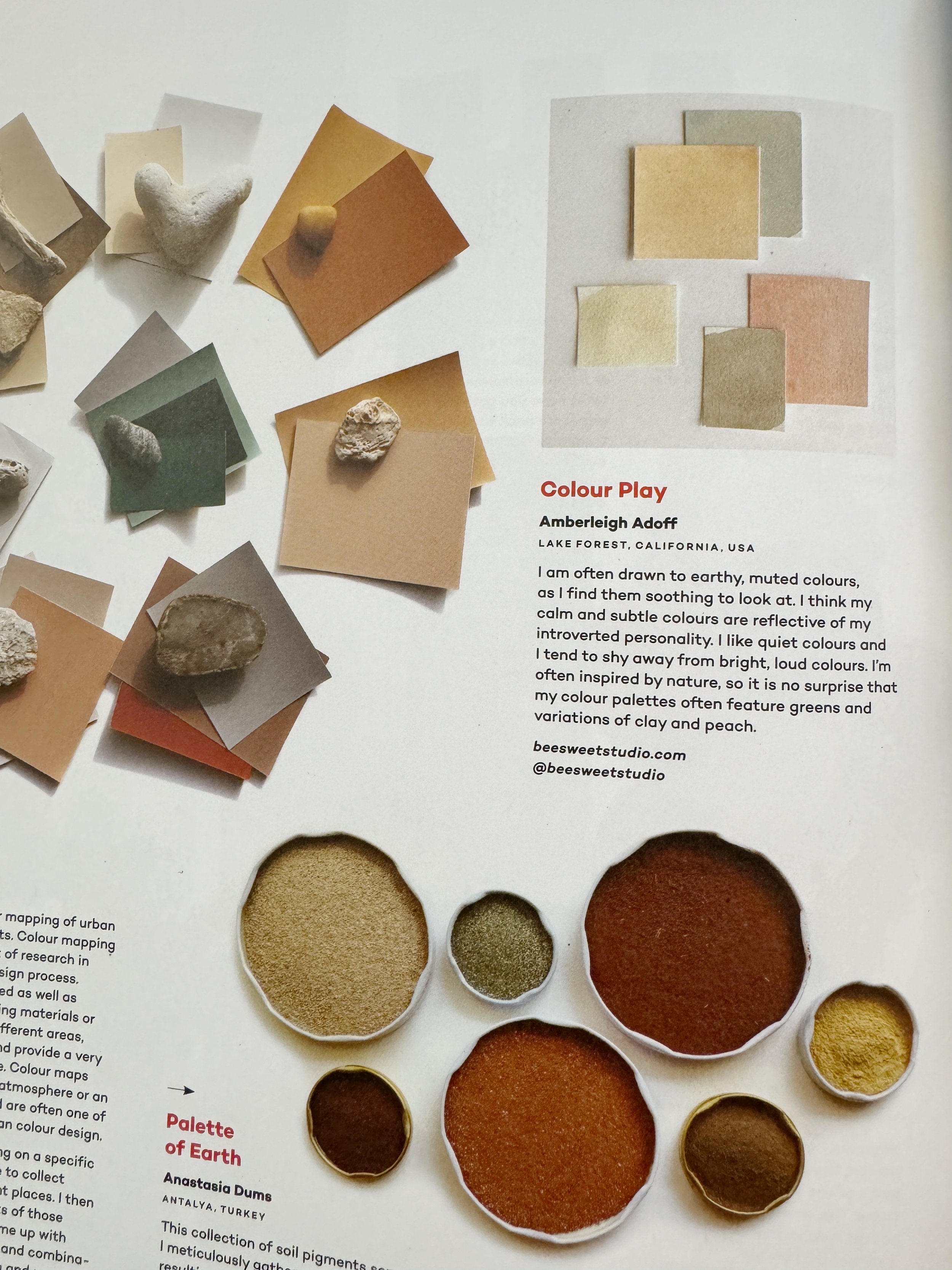
Playing with Paint
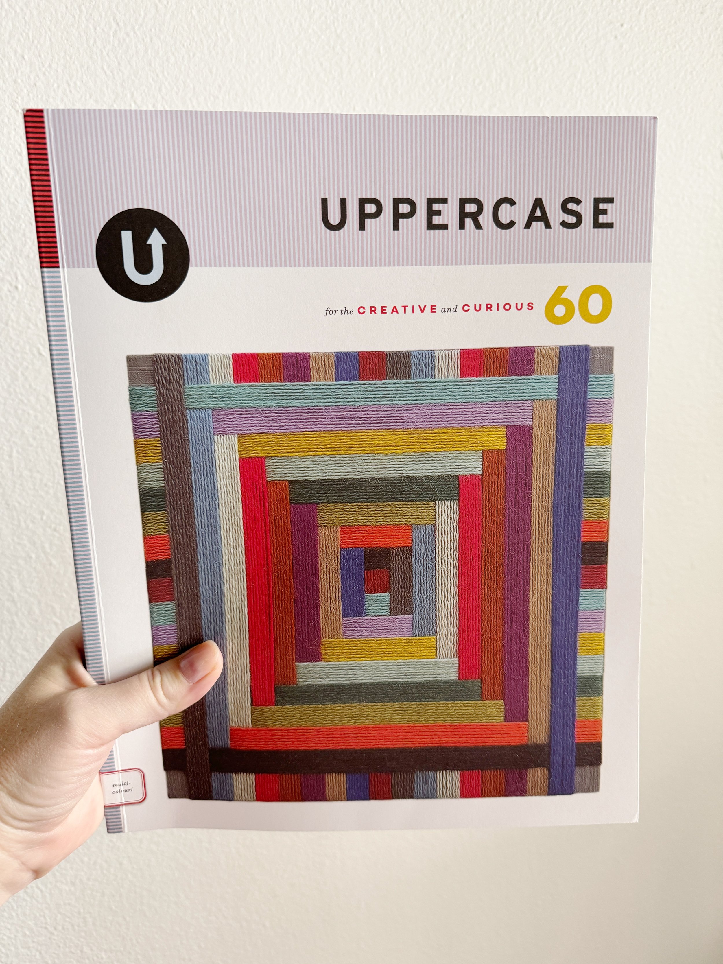
I recently had fun playing around with creating some watercolor swatches. It was good to take a break from my iPad and do some traditional painting. I ended up creating some pretty color palettes and submitted them to the Uppercase Magazine.
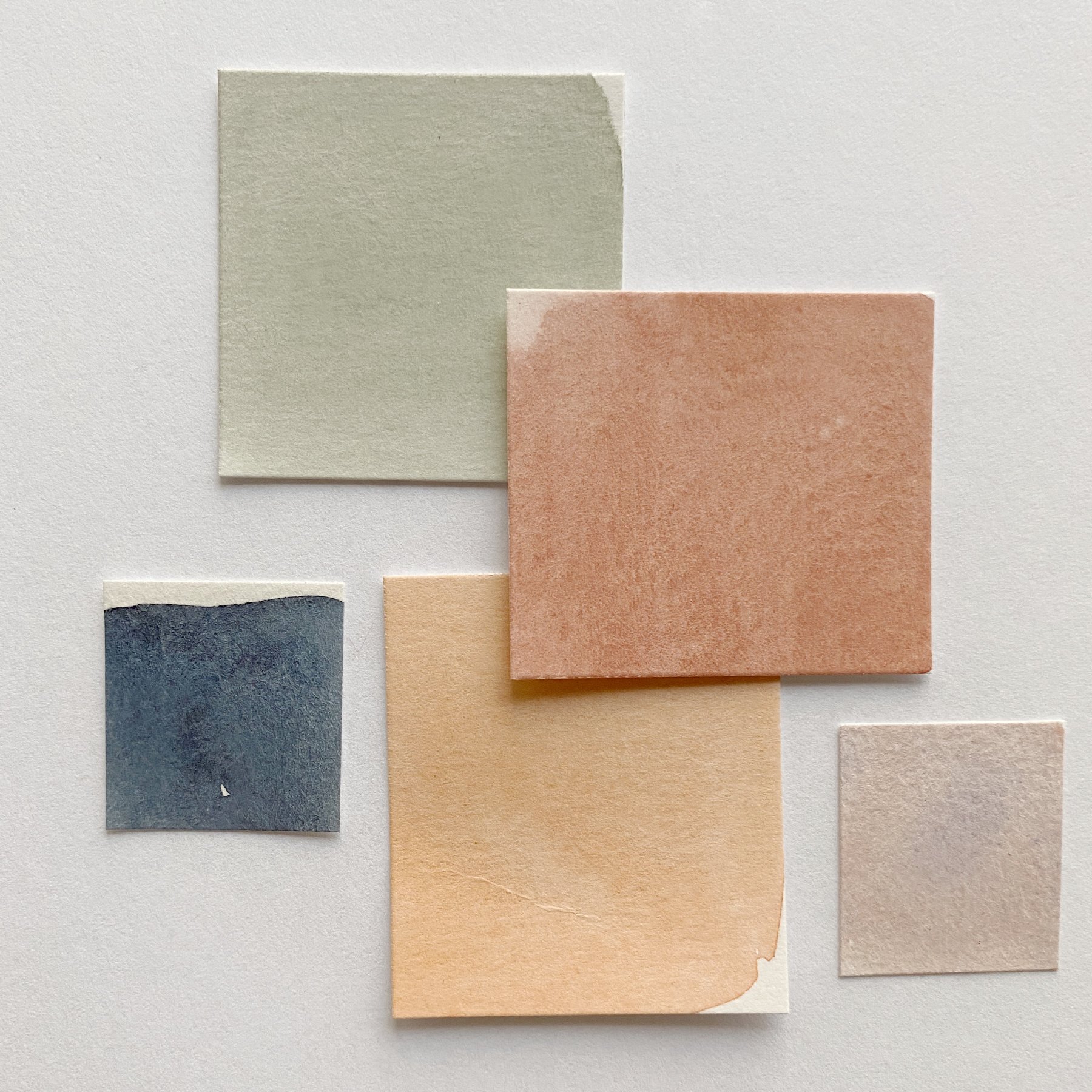
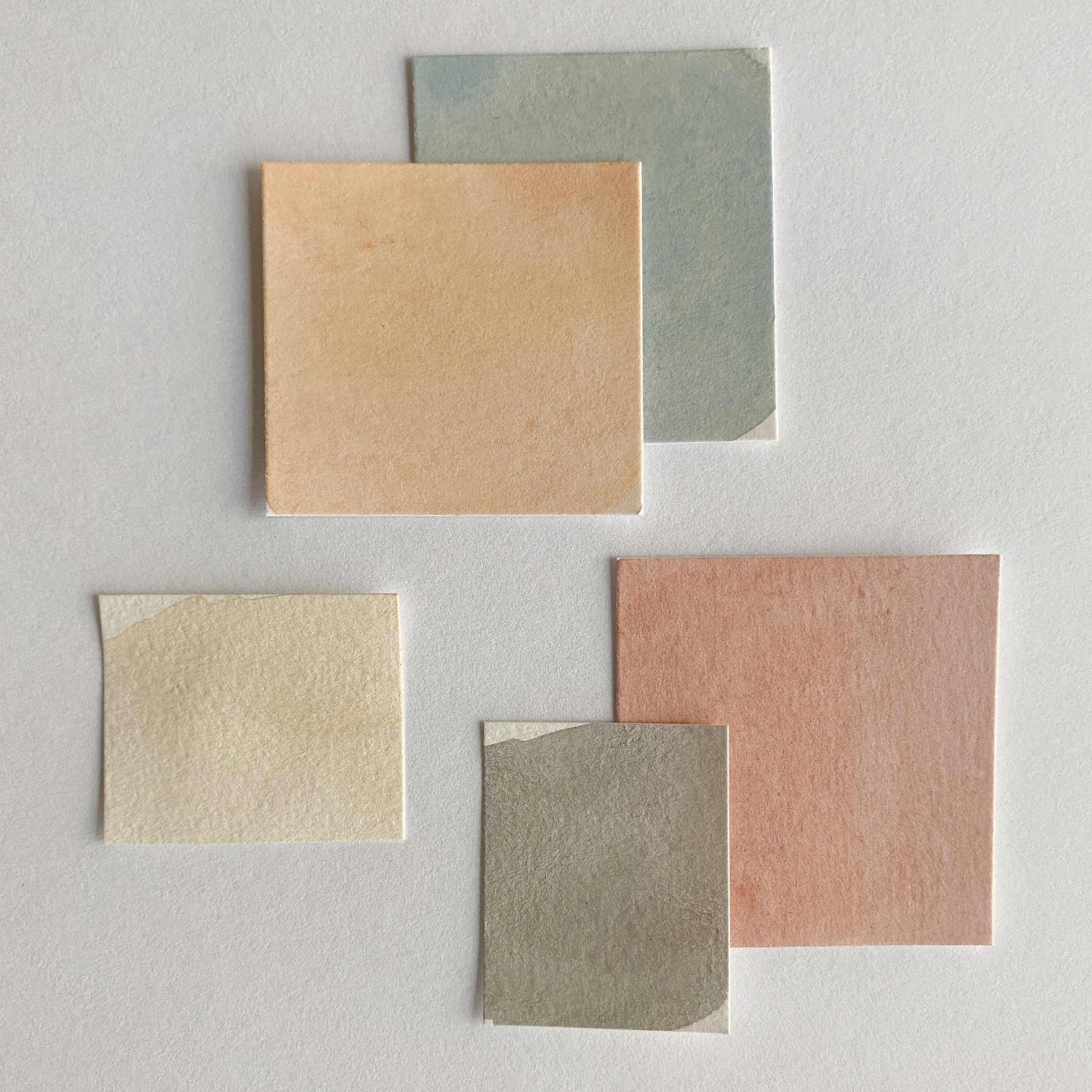
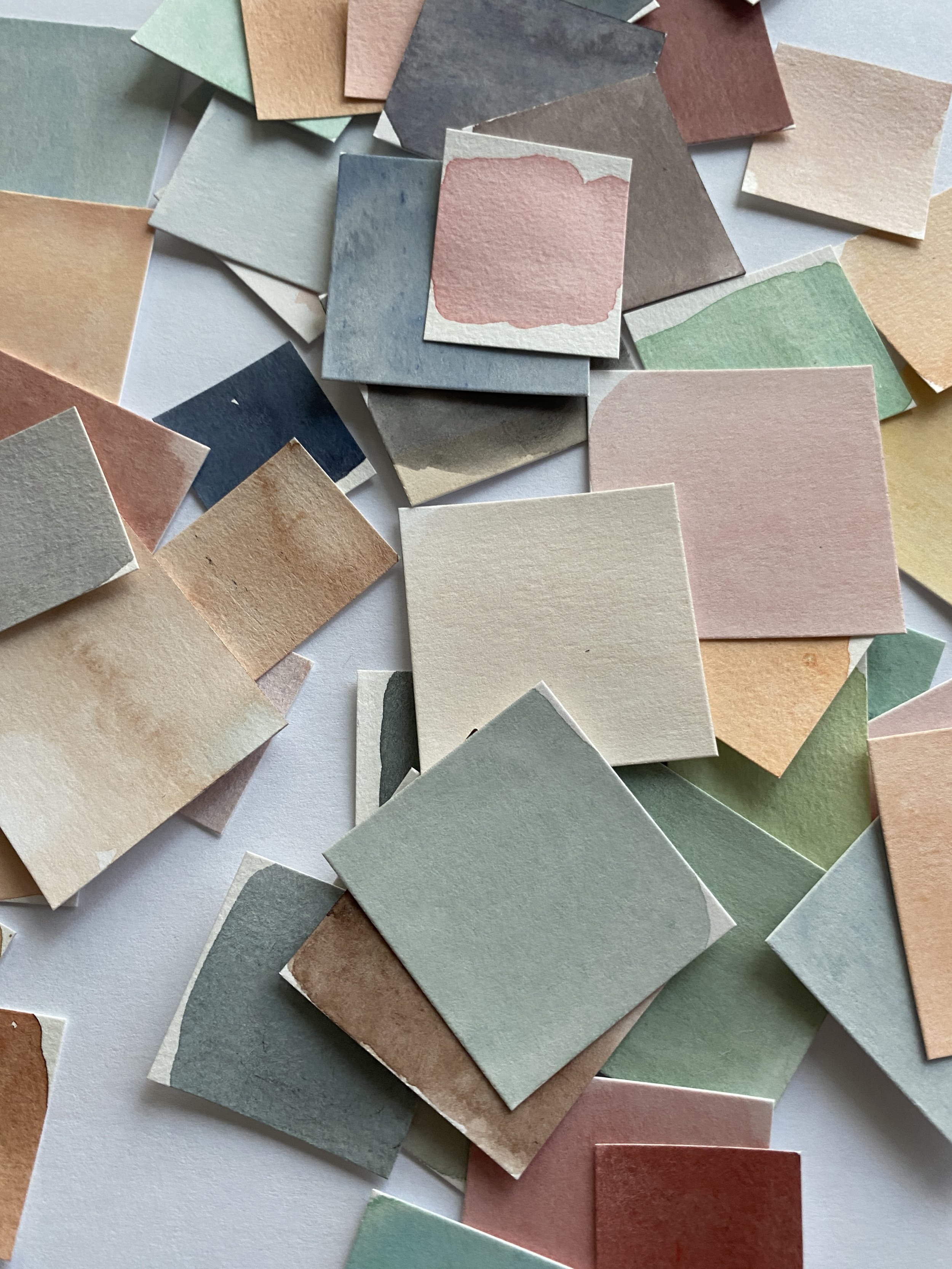
I got featured! Check out my color palette here in the Winter 2023 edition that focused on color. Check out this magazine here!
Now go start building fun color palettes!
Please let me know if there is anything else you would like to know about color and feel free to share your favorite palettes!